Rival Peak
UI & UX
Rival Peak
Rival Peak is an experimental competition reality show, featuring artificially intelligent contestants whose fate is controlled by YOU, the viewing audience. You can interact with the real-time experience through an instant game right on Facebook.
September 2020 - March 2021
Role: UI Artist and UX Designer
Members: Pipeworks Studios, Genvid Technologies, Facebook, DJ2E
Type of Work: User Interface, User Experience, Game Design
Tools Used: Photoshop, Illustrator, Adobe XD, Jira, Confluence
The Problem
How do we create a Massively Interactive Live Event (MILE) for thousands of people to participate in where each of their participation directly helps the contestants?
The scope of the project paired with a quick turn around time required that work be done fast and loose while getting as close to target as possible. The experience itself loomed as a big question mark in everyone’s mind. A large portion of the experience was developed while Rival Peak had already gone live. Problems arose and needed to be solved very quickly, which is easier said than done when the UI was produced by me but implemented by engineers at a separate studio.
The Solution
There was a lot of stepping over toes, having the best idea win, and re-crafting the experience every time a new problem arose. The UI came to life simultaneously with the game world of Rival Peak. Building UI for a live product meant that we needed to wireframe and try to flesh out as many of the interactions as we could in a test space before being put in front of thousands of people. During live development, once a problem arose it was important to iterate on the design as quick as possible to set ourselves up for an experience as user friendly as possible on a mobile and desktop setting.
Wil Wheaton describes what Rival Peak is and shows off the functionality of the UI. He talks about the character dialogs, projects you can participate in, and goals to help the character finish.
Summary
The limitations of Facebook’s initial framework for our experience meant that we had to create work-around solutions for our desired use cases.
In my role, I:
Created a consistent visual narrative between the Instant Game Layer and the Unity Instance
Ensured art assets functioned for HTML/CSS/JavaScript implementation by Genvid as well as implementing assets directly into Unity
Worked directly with members of Genvid Technologies to ensure mockups were being implemented in HTML/CSS according to spec
Switched all the assets in the game in a 2 day span to handle live updates needed due to COVID 19 for a “hacker” takeover
Communicated directly with Genvid CEO & development team as the art representative on the project
Attended design meetings and drove development of the “Action Event” items, “Match 2” game, “Match 3” game, and Map.
Wireframing
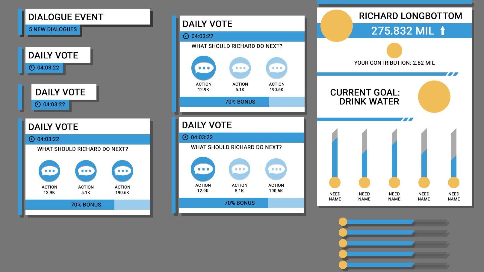
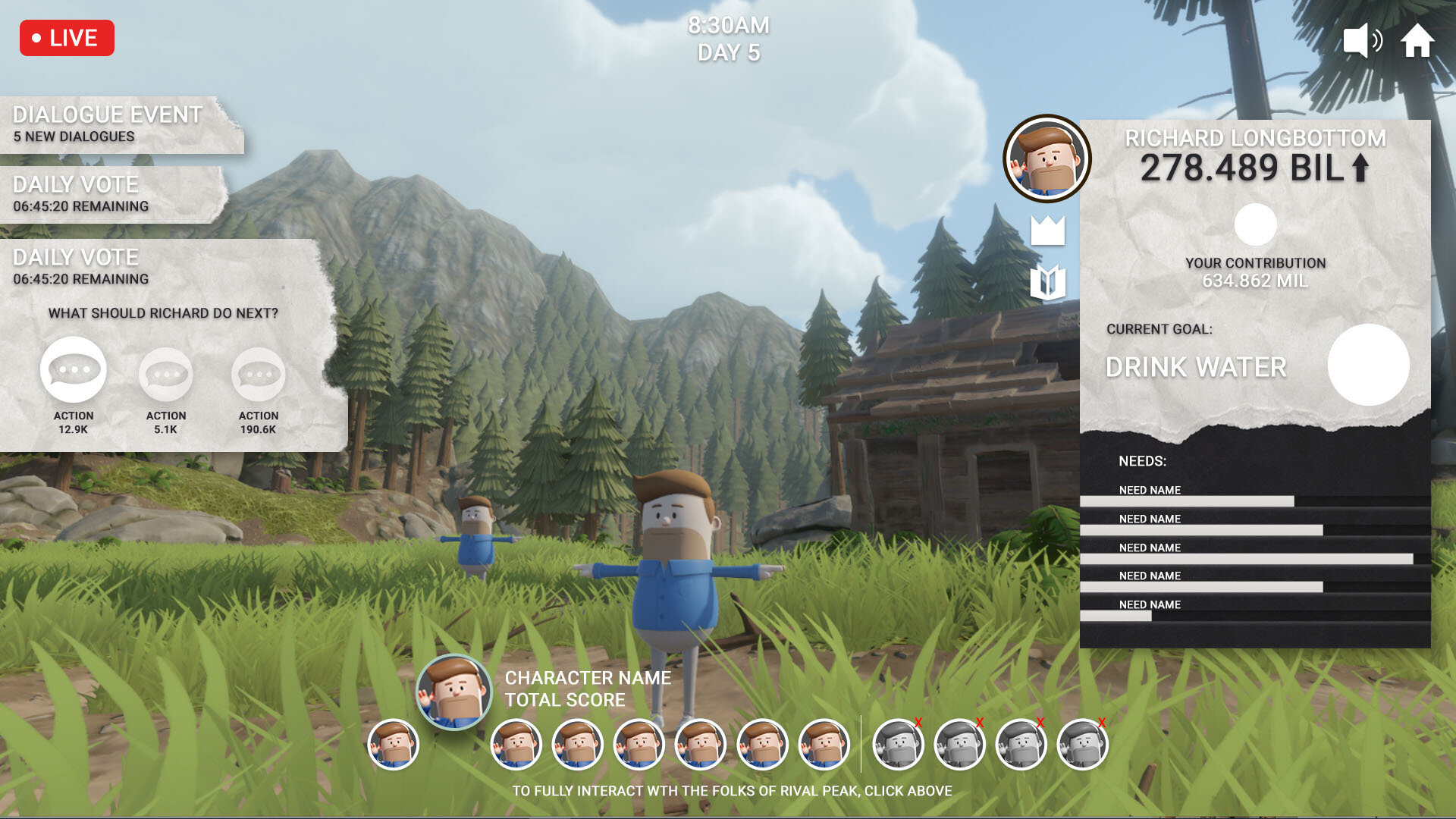
With design documents in hand, it was time to create a fully functioning wireframe that allowed the team to rally behind the ideas and gain a better understanding of the experience we were about to create from the users point of view. The goal of this exploration was to quickly turn abstract ideas on paper into something the team could interact with to at least start to imagine this new type of experience.
Initial Mockups
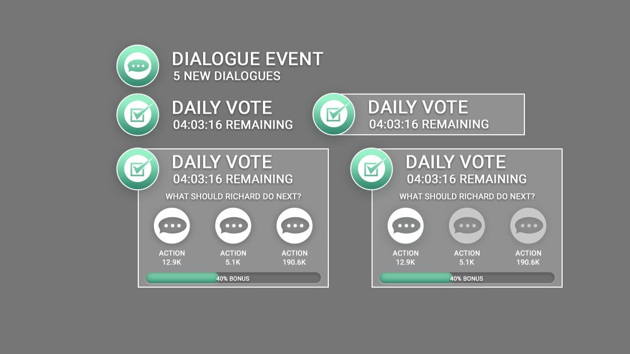
After coming to agreements on the user flow, I began an initial exploration of differing styles based on the initial desire from the team to have the UI be minimal. These explorations were meant to be a starting point for the overall tone we wanted the game to represent.
Closer to the Target
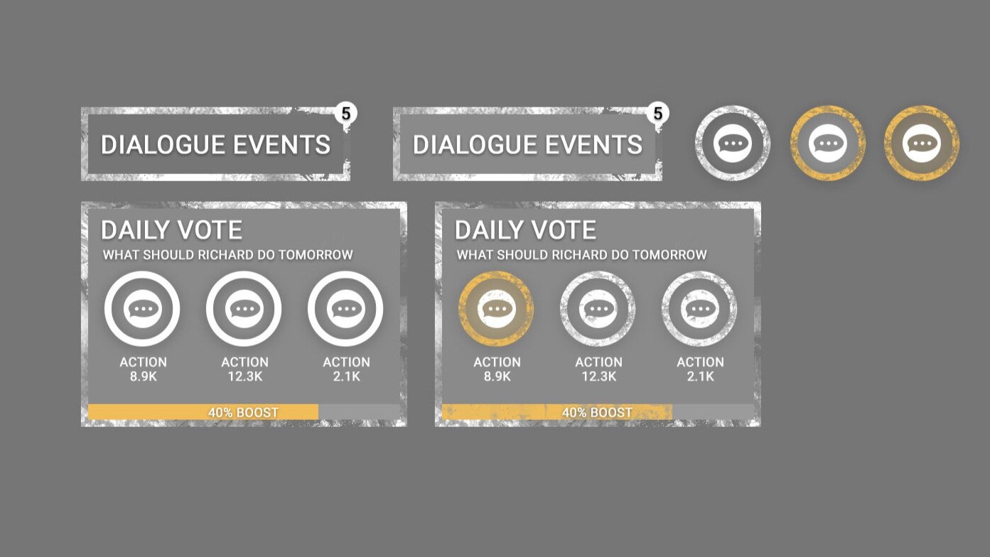
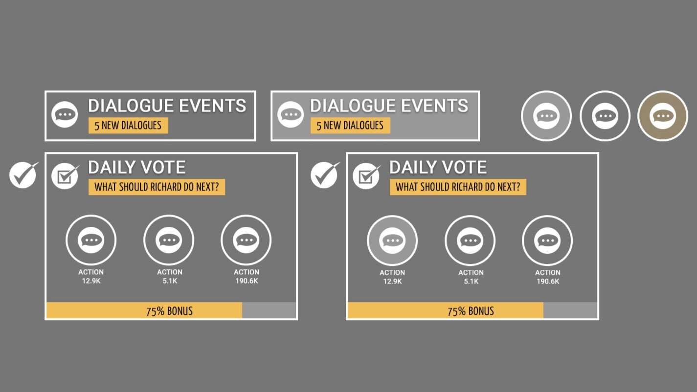
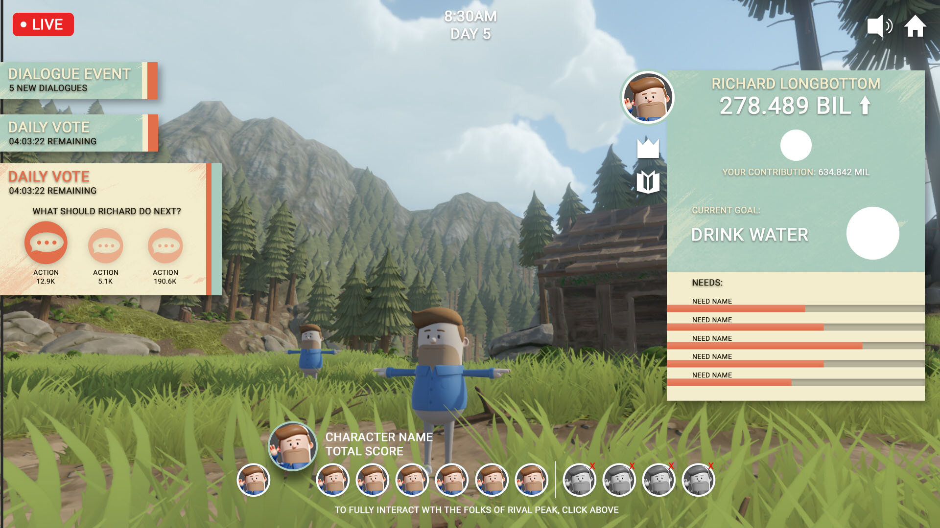
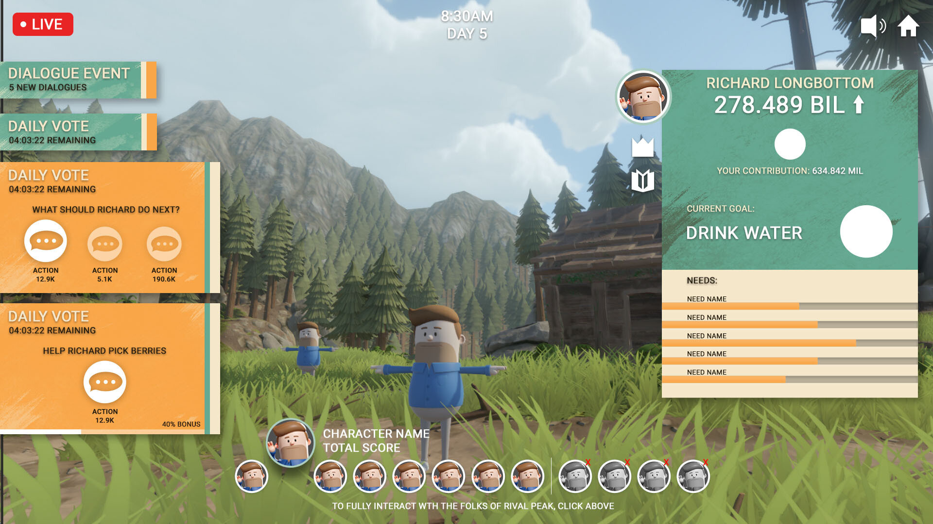
These mockups were used to explore tone through texture and color to try and emphasize a look that paired well with the scenery. The art director approved the third of the mockups above, and I moved forward with creating a cohesive, fun, and vibrant UI system that played on 70’s tropes and the pacific northwest.
Developing a Visual Language
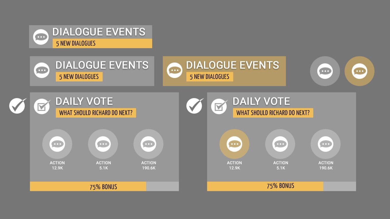
Over the course of development, there became an increasing need for icons to clearly describe the different needs, statuses, and objectives that the characters could participate in during the experience.
There were two main challenges that I sought to solve:
Icons should be visible at small scale
Icons should be easily readable
Since some of the objectives in the game were not blatantly obvious (project, action, clear) it became necessary to create my own visual language that would be directly associated with these tasks as they were alongside some more obvious tasks (daily vote, goal vote).
Because this experience is a mobile-first experience, icons needed to be unique and readable from a distance. This meant that most of the icons needed to be large, distinctly shaped, and not easily-confusable with other icons.
Home Stream - User information and a general overview of all the characters
Character Stream - An individual character, their goals, and your user contribution to their success


