Robits is an education programming game that centers around the player programming a robots AI, finding new parts, and solving a series of combat challenges. It boasts a visual programming system that allows players to design their own programs while picking up on elementally programming concepts like control flow.
Damen Birtola, Luke Mason, Zack Lawrence, John Khaw, David Kirkpatrick, Theo Erickson, Kennan Billimoria, Matthew Reed
UCSC Games Showcase Capstone Award for Technical Innovation
UCSC Art Dean's Fund for Excellence Recipient
The robot editor features your parts and programming as separate tabs. The desire here was for this page to be your one-stop-shop for equipping your new robot arms, customizing how they look, and getting access to the programming grid to control your robot through code. Arms stack in the menu and have individual icons to accompany them. The color selector lets you change the RGB values of each part of your bot.
The programming grid is the backbone feature behind this experience. All of your programming chips on the left are drag-able onto your programming grid to create real snips of code that tell your robot what to do. The flow of energy in the grid gives immediate visual feedback as to if your code is running. The moving arrows and flashing hexagons let you know that you’re in business. The hex grid allows for increased amount of options while teaching about closed circuit energy flow.
I wanted to use shape language that fit with the rough, bright, and edgy world that we were creating. I chose to work with very sharp angular buttons and accentuated them with soft modern animation curves in Unreal. I wanted the UI to be more out-of-the-way in this circumstance and chose to stay with clean lines, easy to read text, and simple colors. The muted colors in the main menu let you enjoy the scenery, while the pause menu features a more vibrant scene to keep you connected to the world.
What I Came Into
The Prototypes
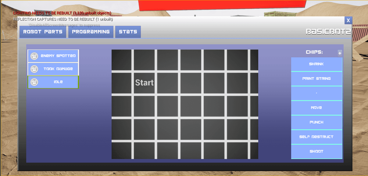
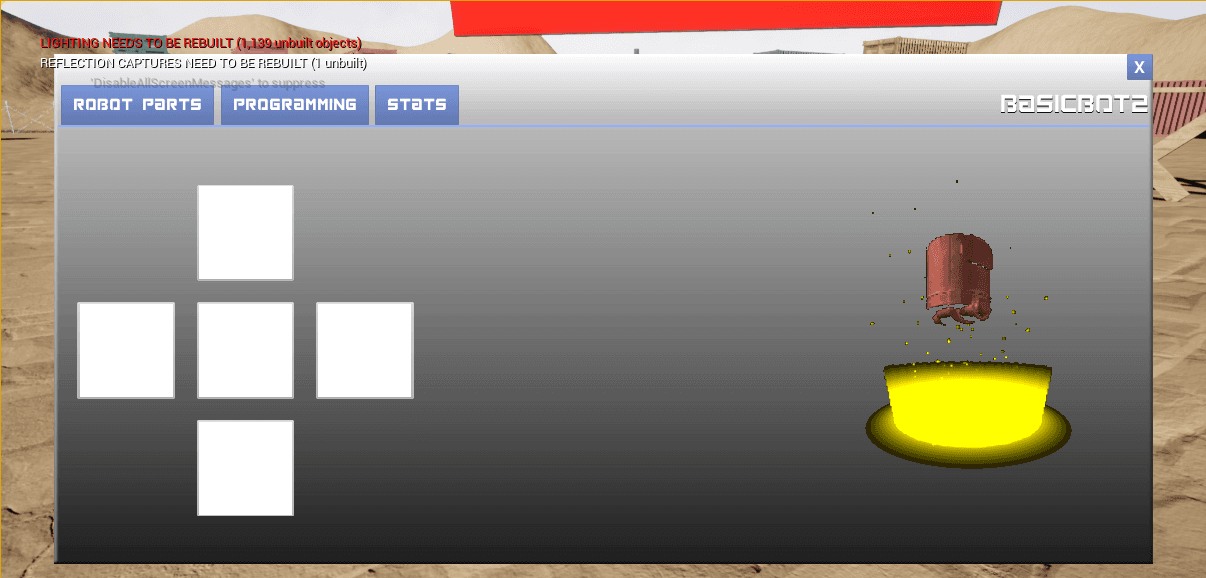
I joined the project after a 4 week prototype session. This was the programming system that it started off with. The robot parts editor was separated into 5 options for arms, head pieces, legs, and core (which wasn’t used). The grid is small, centered, and has a pattern that causes a visual illusion and is annoying to look at. The chips are octagonal on a square grid. The chips themselves are just blue buttons with white text. There’s poor hierarchy and confusing color scheme. There was a lot of room for improvement to not only consolidate a lot of this, but to make it read better. After playtesting, I found points of confusion such as the confusing grid, unclear use of buttons, and non-transparent use of robot parts. Instantly, this lead to iterating a new system to streamline this information for the user.
Where does this go?
Point in the Right Direction
I designed this editor that highlighted the robot and the parts associated. Playtesting showed that users were having a mental dissonance between the robot on the right, and the parts being selected in a dissociated square. The editable parts of the robot are highlighted directly to close that mental barrier and ease the mental load. This iteration had the extra functionality of clicking the robots body to start programming, which needed to be worked out more since it wasn’t directly being communicated. This takes the two panels of programming and putting on parts and combines them into one interactive space. Unfortunately, players had a difficult time understanding the system, so it was back to the drawing board.
One of the critiques we got that our UI felt very separate from the world. I realized that all of these screens I was making were very much their own pages, and not incorporating the world. I opted to keep the same functionality of the pages, but instead make them fade into the world. We decided to allow these semi-transparent panels to do the work and allow the background to show off more of the world. By incorporating the robot in a garage environment with these live elements, it really allowed the world to remain feeling alive while allowing for both direct interaction with the robot in addition to aligning with pre-existing notions of how menu options work, such as clicking the weapon you want and being prompted to apply it.
One of the critiques we got that our UI felt very separate from the world. I realized that all of these screens I was making were very much their own pages, and not incorporating the world. I opted to keep the same functionality of the pages, but instead make them fade into the world. We decided to allow these semi-transparent panels to do the work and allow the background to show off more of the world. By incorporating the robot in a garage environment with these live elements, it really allowed the world to remain feeling alive while allowing for both direct interaction with the robot in addition to aligning with pre-existing notions of how menu options work, such as clicking the weapon you want and being prompted to apply it.


