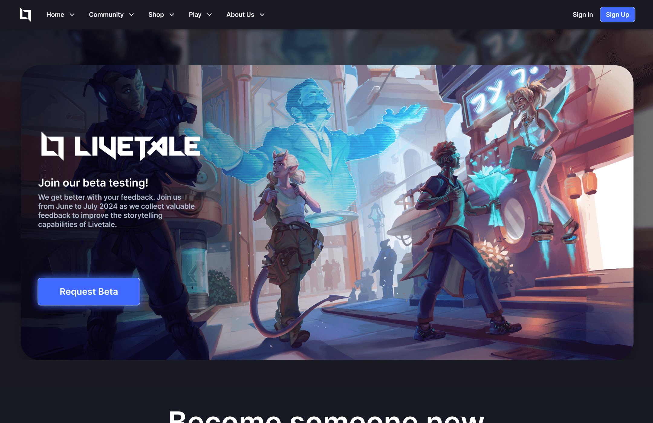
Livetale is a digital roleplaying platform that promotes embodiment of your digital avatar to produce more emotion driven experiences for TTRPG players. Players can create or leverage Tales to tell stories together. Each Livetale will be played differently, even if they're sharing the same source material — sorta like a play or theater performance.
As Senior Visual Designer, I helped establish Spellbook, the design system used for creating updates to our web and unity experiences.
I worked alongside the web development team to establish best practices for maintaining and updating the website, and worked alongside Unity developers to create specs for complex design systems like the character builder.
Identifying the problem
Roleplaying games are played partially in the imagination and partially using a game board or VTT, or in the case of larping, a space for interaction.
The connection we have to our character is limited to the voice acting, appearance, and expressions of our characters.
When telling complex stories with moments of joy, sadness, anger, and surprise, we need tools that help others feel the things we are trying to express.
Livetale is a digital platform that leverages MediaPipe for facial recognition and integrated voice modulation.
This way, even if you have a deep voice, you can create a fairy princess elf character, with long flowing hair, and utilize voice modulation to sound like a high pitched femme fatale.
Players can come together to be who they want to be - voice, face, and body - all controllable so you can play our dramatic melodramas, serious true crime, or vintage detective fantasies with new and old friends.
Research the Market
VTTs -> Roll20, Owlbear Rodeo, Foundry, Talespire, and One More Multiverse are just a few of the ones that we found during research.
Leverage pre-existing expectations -> Seeing where we fit in and identifying the portions of our product that can stand out.
How do we differ -> They are over-reliant on a game board and often lean towards a 2D top down aesthetic.
Commonly Seen -> Most VTTS have a rugged vintage look like Dungeons and Dragons or Baldurs Gate 3. This style often lends itself to pigeonholing itself into ancient times and tends to appeal towards older audiences.
Who's our audience? -> Users in the 18-28 age range, with the intention of opening up our software to younger audiences as well, like Roblox.
North Star -> We decided to look towards games like Valorant, Breath of the Wild, and Genshin Impact as sources of inspiration that tend towards a cyber fantasy style.
Designing for Users
I utilized FigJam to create user flows for features such as User Permissions, Tale Creation, Menu Explorations, and the pipelines of Web <-> Software interaction.
I created a design system for the team to use when building websites and key functions for the in-game Unity experience.
I developed dynamic components with exposed variables that allowed for quick and modular changes to designs.
Designing this way allows me to create states and animations in Figma that I can easily show off to the team and use as a reference for implementation on both web and Unity.
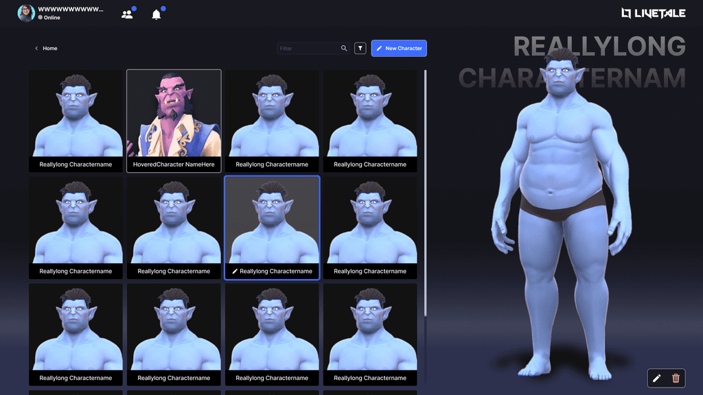
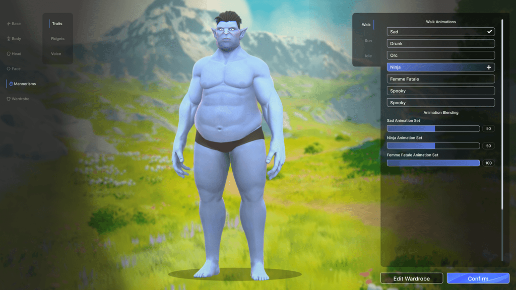
The initial iteration of the character builder did not have the complexity needed for all the features that could be implemented by developers or for UGC (User Generated Content).
My goal in redesigning the character builder was to focus on making all the different features of the character uniquely discernible and modular. This included exposing variables for minor changes, reducing UI weight to focus on character, and expanding all options available to players.
Before
After
During my time on this project, I learned a ton about scalability and design systems. Because this project was not as far along as a lot of the other projects I have been on, a lot of my work did not make it into every update while engineering worked on more game-breaking bug fixes.
I am really proud of the work I did on components in Figma and the scalability of the system I was able to develop by myself. One thing I would like to improve from my time on this project is moving away from generic shape styles and delve more into a stylized game aesthetic with more color and vibrancy.


